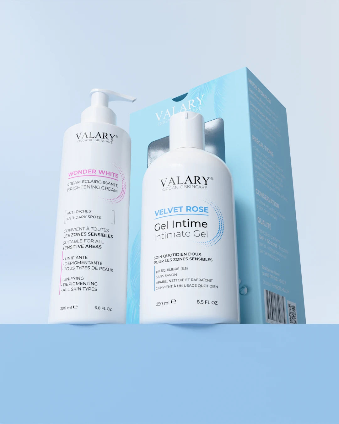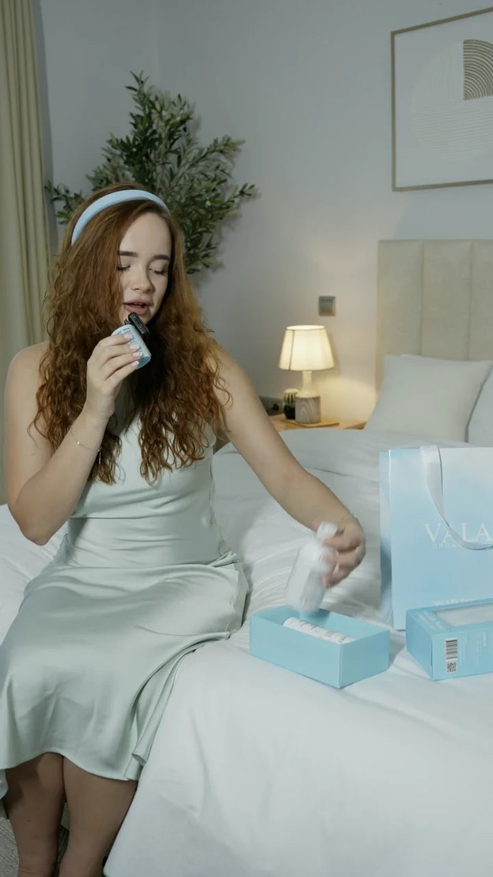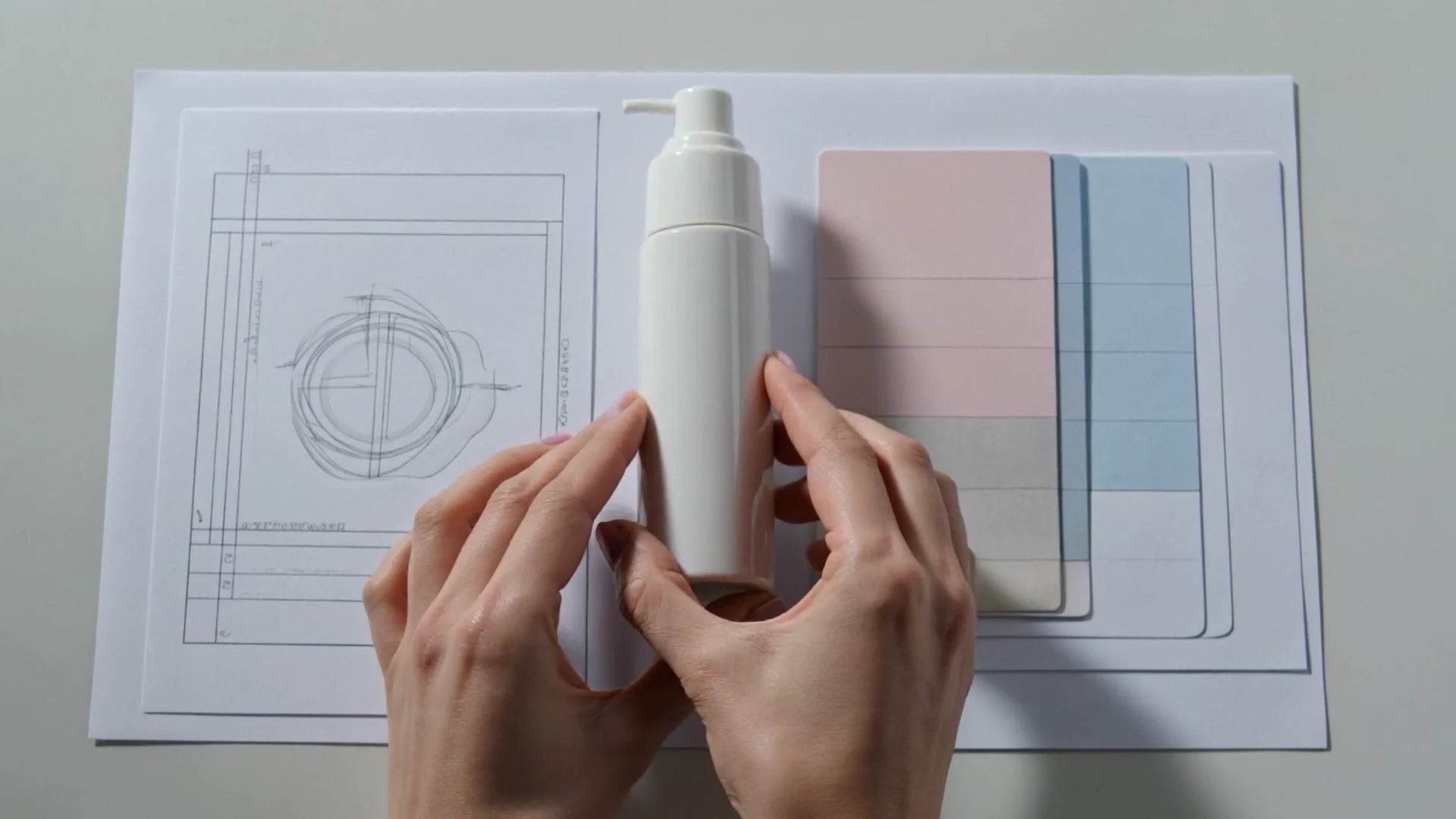
Begin with one message
A product visual has a small amount of time to communicate. Before opening Photoshop, write the one thing the viewer should understand: the product name, a specific use or a new collection. Choose the intended destination too. A portrait social post and a wide website cover need different compositions, even when they share the same photograph.
Prepare a short brief with the audience, message, format and action. Gather the approved logo, packaging artwork and original photographs in one folder. Keep reference images in a separate inspiration folder so they cannot accidentally become published brand assets.
Build a file that can change
Place the product photograph as a Smart Object, keep typography on separate layers and organise related elements into named groups. Use masks to control what remains visible. Adjustment layers let you refine tone and colour without permanently rewriting the original pixels. These tools are useful when a campaign needs several sizes or the packaging changes.
Our suggested layer order is background, product, shadow, colour adjustments, headline and logo. It is a working convention, not a requirement. Name layers for their purpose, such as “Product — approved pack”, instead of leaving a long list of unnamed copies. Save an editable master before exporting a flattened web image.
Give colour a clear role
Start with a neutral background, one primary brand colour and an accent used sparingly. The product should remain recognisable. If a background makes a white bottle disappear, change its lightness or add a realistic shadow before adding more decorative elements. Use the interactive study below to compare a few background directions.
Treat skin and packaging colours carefully. A mood can be warm or cool, but an edit should not suggest a product colour or result that the photograph does not support. Compare your final image with the original under the same viewing conditions.
Design for the smallest screen
Read the composition at phone size. Can the main message be understood without zooming? Keep important text away from edges and avoid putting several competing claims on one image. For a website, use live HTML text for key information so it can translate, resize and remain accessible.
Export a web version with sensible dimensions, inspect the file at its displayed size and keep a high-quality original. Before handover, check the logo version, spelling, contrast and product label. A coherent visual system comes from these repeatable decisions as much as from a striking first concept.
Further reading
Try it in your next project
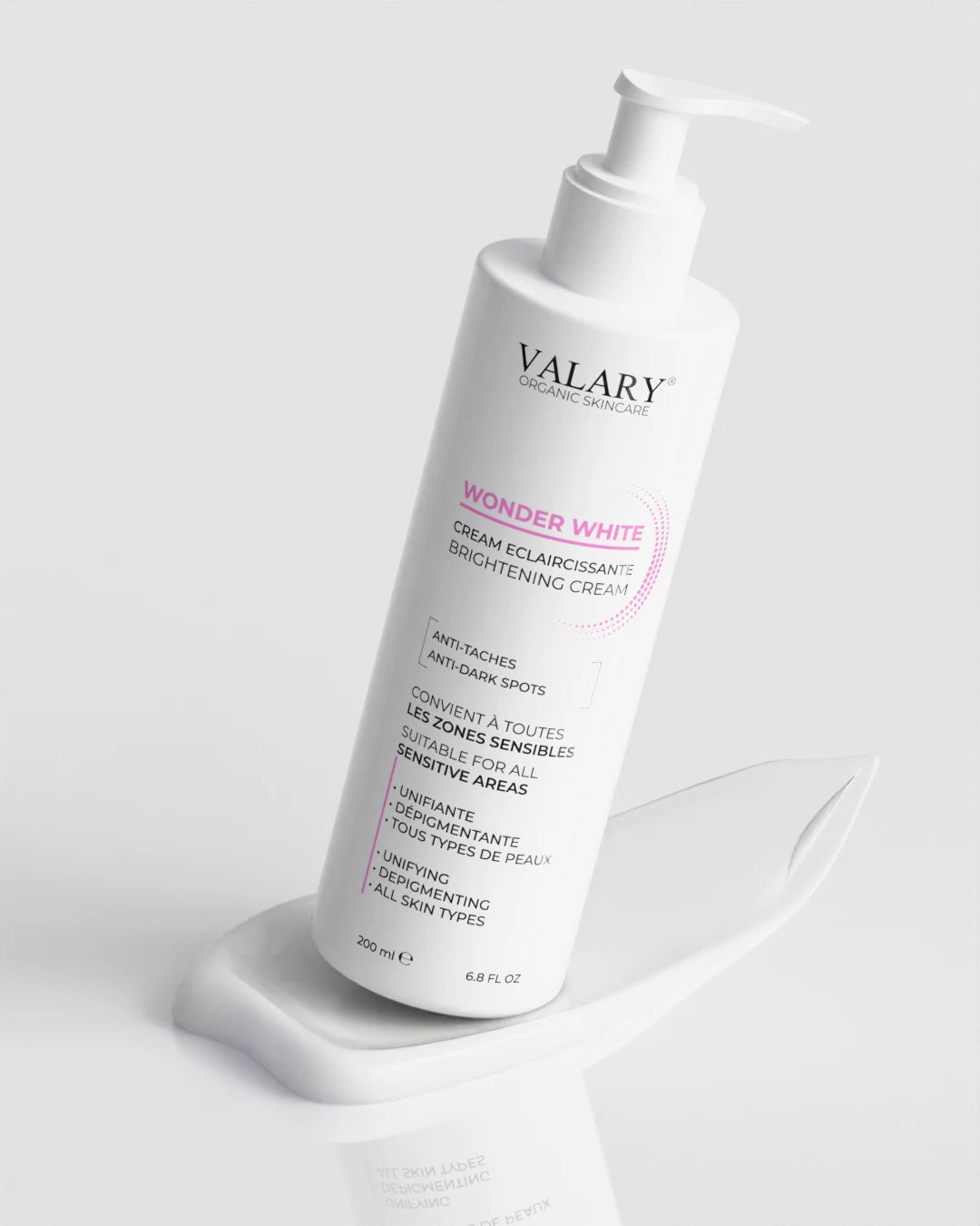 VALARY
An original learning mockup inspired by a layered editing workflow. This is not the Adobe Photoshop interface.
Opening image: an AI-generated concept scene illustrating the creative process.
← Back to the journal